Mobile internet has more than just exploded in popularity in recent years — in many countries, it has completely taken over.
Take China, for example, where 98 percent of the people who use the internet do so on mobile.And there is a global trend towards favouring online shopping, with around 1.92 billion people predicted to make an online purchase in 2019. And, by 2021, mobile e-commerce will contribute to roughly 67.2 percent of e-commerce sales.
It is official: the way we interact online has changed. Hands are the new navigation system. And this doesn’t just apply to mobile phones as tablets, iPads, and certain laptops all require touch-screen interaction. Web designers need to do more than think about how our pixels look: they need to also imagine how they will feel in someone’s hands.
Enter UX design or user experience design: the process of analysing ease of usability.
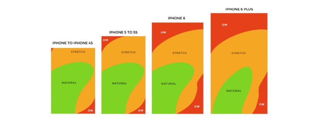
Mobile device use has paved the way for innovate design and a focus on usability. See “How We Hold Our Gadgets” by Josh Clark for more insight on the topic.
Here’s What We’ve Learned About Optimising Websites for Mobile So Far
- It’s all about touch. Generally speaking, users navigate with their thumbs while the rest of their hand supports the device. Refrain from putting links, buttons, and clickable text at the sides of the screen as much as possible to avoid accidental clicks away from the main page.
- Hover features are redundant.We can no longer depend on mouse pointers and hover features to indicate whether an item is clickable, so ensure that the calls to action are clear.
- Avoid small fonts. Unless your users have dainty, childlike fingers, chances are that tapping and navigating certain sites can be difficult. Be aware of how clickable your links and buttons are. Fonts should be larger on mobile than on desktop. Ideally, there should be no need to zoom in and out to access links.
- Background colour matters. Fingerprints make smudges, which blur the screen. Typically, black is a no-no on mobile devices as it enhances all those greasy fingerprints and makes readability difficult in sunlight.
- Keep it brief. Remember: mobile screens are a lot smaller than laptop screens and they therefore condense information, making it a long, narrow piece of text. Break text down into bite-sized chunks and bullet points. Avoid lengthy fields on forms. The aim is to have easily scannable content.
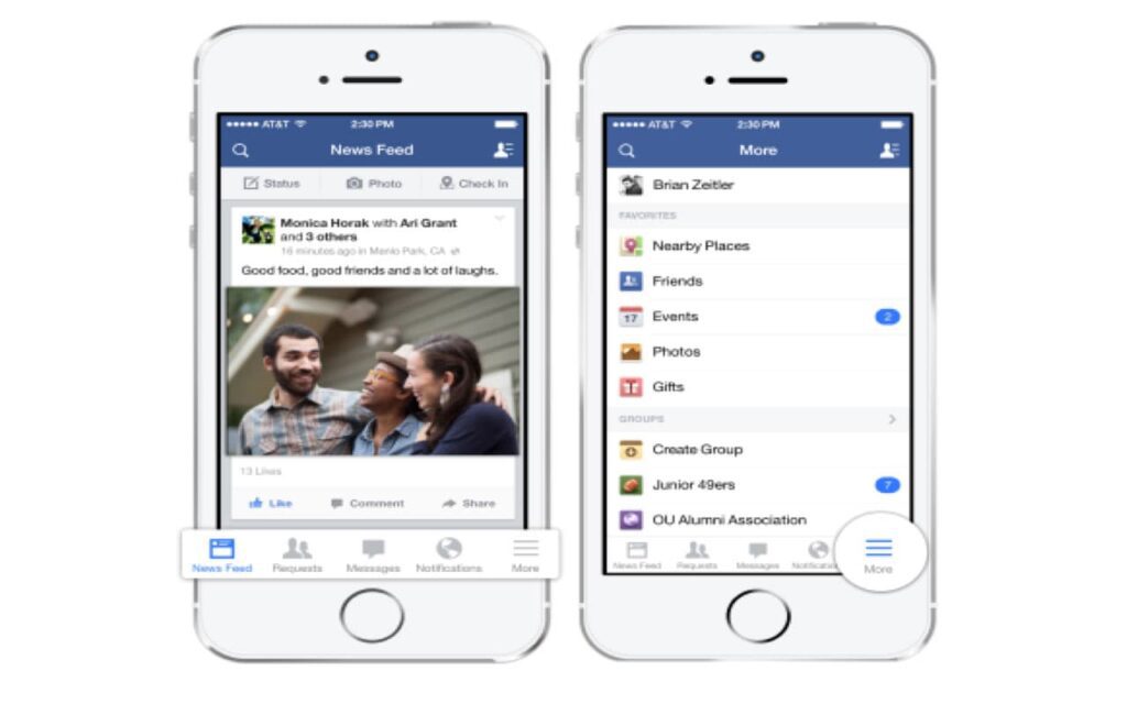
- Menu length. Screen size variations can alter the appearance of a menu, often making it impossible to display a full menu as you would on a desktop. Here is where the iconic hamburger menu comes into play.
The Evolution of the Screen and Hamburger Menus
How it works: With the introduction of the smartphone, hamburger menus solve the issue of limited, valuable space on smaller screens. The majority of internet users will have encountered the hamburger menu at some point (see the three-lined icon below). Simply click on the icon, and the menu expands. It can be tucked away just as easily.

Why it works:
- Simple Design.It is minimalist, intuitive, and compact — ideal for the modern website.
- Functional. No need for bulky, invasive menus. The dropdown menu means all items are neatly tucked away and can be easily untucked when the user decides.
- Fixed and Always Visible. The hamburger menu stays with you as you scroll, giving users constant access to the menu without an overwhelming menu taking up most of their screen.
- Universal. Functional on both mobile and desktop.
How it looks:
Placement of Hamburger Menus
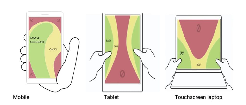
As most mobile devices are held in both hands and the content is largely navigated with the thumb, there has been some debate over the most effective placement of the hamburger menu. Before I go any further, let’s take a look at the images below.
SOURCE: APPTIMIZE
Seems pretty obvious which sections to avoid, right? Even on smaller smartphones, our fingers can easily reach the bottom ⅔ of the screen but require us to adjust our grip to access the top ⅓. That being said, hamburger menus should be placed in a section of the screen that is easily accessible but not intrusive (generally speaking, you want a menu to be accessible but not directly underneath your thumb). Although there is an ongoing debate about the placement, the majority of apps opt for the lower right-hand side.
The Takeaway
The evolution of the screen and a shift towards mobile devices has encouraged web developers and designers to reevaluate user experience. Although there is still some way to go, a lot of the research has already been done, and there are clear steps you can take to make your site more user-friendly across a range of devices. Be aware that not all internet users have a keyboard and mouse readily available, and so you’ll need to adapt your layout and design with this in mind. For an idea of where to start, check out the tips above!
Emma is a Content Coordinator for TourismTiger – the premier web design agency for tour and activity operators. We build websites that sell tours. Get started on yours today.
Need more free advice?
Chris and his team will send you a weekly email offering high-value insight and advice about a variety of marketing and business development topics related to the tourism industry. We address specific destinations, tours and activities, and the hotel industry. We also provide important travel industry news and updates.

