At TMA, we regularly work with the great, the good and the emerging talent of the tourism industry. So, we know what it takes to be a leader in the travel and tourism industry.
Here, in a series of blogs and articles, Chris shares his tried and tested views on the anatomy of successful tourism websites:
“It’s true that the success of a website is defined by the experience a customer has when they visit. Having worked with many leading and fast-growing names in the tourism industry, I am convinced this is even more the case when it comes to tourism-based websites. Here, the customer experience is paramount.
For tourism businesses, the customer experience starts with the first click, not when their feet first hit the airport tarmac or when they take their first steps on the sand. This is something that’s become my mantra and it’s a firmly held view that has benefitted our clients.
To achieve the best customer experience, then tourism companies need to accept everything about your tourism website matters. Absolutely everything:
Home Page Banners – 7 Golden Rules
The home page banner is the most important element of your home page. When a customer visits your site they need to grasp exactly what experience you are offering from the images, video and content you are displaying.
1. Use video in your home page banner
Without exception, you need to use video as your banner for your desktop view. Video can tell your story more effectively than images can. It can show your customers exactly the type of experiences you offer and video will ensure your offer is impactful and persuasive. Video will inspire them. Thanks to video, clients will resonate more with your website, your brand and your offer.
2. Copy for your home page banner
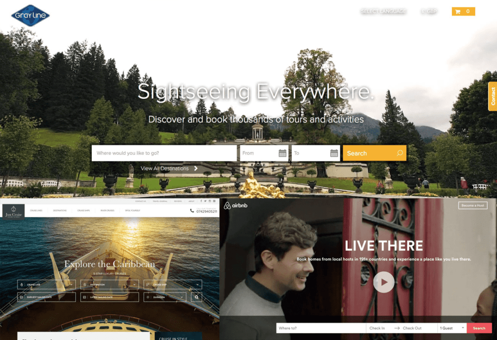
Take a look at the example above from grayline.com This type of homepage banner, combined with a succinct but impactful title like ‘Sightseeing Everywhere’ and supporting subheading like ‘Discover and book thousands of tours and activities’ tells the user exactly what you are offering them and it is suggestive without being too sales-y.
3. Sources for visual content for the homepage banner
These days producing video, even a professional one, does not need to cost the earth. If your budget is tight, you could run a competition for user-generated video that you can cut together. Also, Big Stock Photo is a good source to check as they have a wealth of tourism videos you can purchase very cheaply.
4. The exception to the video rule
When it comes to tablets and mobile, swap the video on your website for an image. This is really important because by doing this you will avoid turning people against your website over the fact that your video is eating up their bandwidth. This is especially the case if the user is viewing form ‘abroad’ / at their destination and are trying to book an activity, for example.
5. How to use imagery on the homepage
If you really can’t or don’t wish to use video (although we think it’s a must) then good photography is the next best thing. Full screen images can also work well but stay away from stock images. Unlike stock video, users can tell if the image is stock. This gives the perception of being false, and in turn can make your business seem false and phony. Your customers are likely to lose trust.
If you have an image sliding banner make sure you have no more than 3 slides. The vast majority of customers will not flick past the first 3-4 images. Sticking with 3 also helps with site speed, especially when using larger images.
6. Navigation
A simple yet easy to navigate the menu system is also important. Customers should be no more than 3 clicks away from booking a particular tour or room. Normally this can be done within 2 clicks.
7. Search
Finally, your homepage must offer tour search. And this must be prominent. Look at the most successful sites within the industry. AirBnB, Viator, Gray Line, Sky Scanner etc. all have a prominent search that makes it very easy for the user to find exactly what they are looking for.
But it’s equally important not to offer too many options. Imagine the user viewing the results on a mobile. To make the results more manageable and accurate, offer a keyword search and an option to select a date – a ‘to’ and ‘from’ date. The final thing to offer here is the option to search for a type of activity via a drop down. Leave the rest to filters. If you offer too many options in the search, you risk dis-engaging the customer and they walk away.
What content should be featured on the homepage
Highlight your specialisms, featured tours and/or destinations
The next thing to consider is what content you will feature on the homepage of your tourism website. Under your main banner you should showcase some of the main tours, rooms or destinations you offer. Always highlight your best selling tours or destinations and only your best sellers in this area.
The case against showing discounted content
Don’t show tours on special offer, unless you run a discounted tour website. Why? It will impact your profit margins. Also, if the visitor to your site is a new customer, having this information up front will impact their expectations of you as a business. In other words, if it’s one of the first things they see, they will regularly expect discounts from you.
The rule of thumb here is that you’re trying to sell an experience, not tell customers you’re cheap. Poor quality is normally associated with cheap deals and that may be how they’ll perceive you.
Tell a little about your story
‘Little’ is the operative word here. On your homepage, have a small panel of text to describe who you are and highlight your brand ethos. Keep it to a maximum of 250 words for best results. SEO no longer needs paragraph after paragraph of content.
Keep the longer version for the about us page on your website. That way you can get a succinct message across and let the user decide if they wish to read it.
Personal touch
If you offer an experience which is accompanied with tour guides or destination specialists then highlight this, and indeed invite them on your tourism website.
Encourage your tour guides to contribute to the website on a regular basis. Allow them to tell their stories and own experiences. It will work wonders for engagement in your site and for your sales because people buy people.
The personal touch shows you put people first and underline the personal touch you provide.
Competitions
If you run regular competitions then make sure you dedicate a panel for this on your tourism website homepage.
If you don’t run competitions, then think about doing so. Competitions help generate customer interest which in turn can convert to additional bookings. You can also use competitions to help build a library of user generated content for the site.
Competitions can also help build marketing contact data. Although you need to get an individual’s permission to use their details in this way, with their agreement you can target these customers with deals further down the line.
Offers
The best practice for the best performing tourism websites is to show a small selection of no more than 3 products that are discounted or on offer. You can use this area to help sell last minute deals and off-season trips. I’ve found that it’s best to add a button below this section to allow the user to view more discounts / offers you may have.
Latest Blogs/Articles
A blog is a key part of your online marketing strategy. And, a well managed tourism blog with good, compelling content will bring people to your website because it will help customers find you online via social media and will improve your search engine rankings. In turn this will increase traffic to your site. More traffic can mean more sales.
On the homepage of your tourism website, highlight 1-3 of your latest articles. Google loves new content and with this area updating on a weekly basis (you should post at least twice per week) will help with rankings and driving traffic to your site.
Build up a series of advice guides and articles as this will help your business be more visible and you’ll also be seen as an authority within your sector. It builds trust and helps build your customer’s experience with you and their perceived experience of your products. Remember to make your blogs consumable and use good images and video within your posts.
Make your customers feel like you want their company
Do not, repeat do not hide your newsletter sign up section in a footer showing nothing more than an email field and a submit button with a title of ‘newsletter’. Would that interest you enough to sign up? No. Customers need to know what they will get in return if they do sign up. The knowledge of being on a mailing list is no longer enough. Expectations in the travel and tourism industry are much higher.
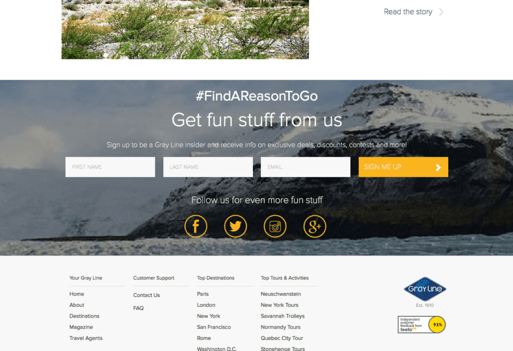
Using a sign up area, like on the grayline.com example above, tells the user that if they sign up, then they will receive fun stuff. It generates a ‘fear or missing out’ feeling! To make this work, you need to offer your customer something that they will only receive if they sign up to your newsletter and give you their details. They need to know this will not be available to the user who doesn’t sign up. For instance, those on your mailing list might get advanced warning on a sale. They might get information on discount codes. Or they could be the first to hear about a new tour before it goes live to the public. Make them feel special. Make them feel like a VIP.
You will also see on the example above that the sign up box is visually appealing. It covers the width of the page and is set against a striking image. It’s an intrinsic part of the site’s design and isn’t an afterthought. And they’ve also used the space to highlight the additional ways to engage with the company via social media. It makes sense to do this here because the customer is already in the headspace of connecting with you.
Footer
This area should clearly show quick links, accreditations, social media icons and contact details.
In the past I have had customers say they do not wish to show an address or even a phone number, as they don’t want to receive lots of calls. They only want to sell tours online. But, our experience and feedback shows that this is the wrong attitude to have. If you don’t show your contact details, it looks like you have something to hide. And, it can also look like you don’t care about your customers enough to offer them another route to contact you, should they need to. So, ultimately, why should they bother booking with you?
The footer is also the best space to show your accreditations like ATOL, ABTA or other well-known specific memberships. Web users are savvy and they expect to see this. Displaying your accreditations is especially important for an e-commerce site in the travel and tourism industry because it helps build trust and gives the customer confidence to book.
Side notes
Another powerful tool you can foster on tourism websites is to include an Instagram feed. It is brilliant for gathering and displaying user-generated content. And as mentioned earlier, the travel and tourism industry is brilliantly placed to capitalise on what Instagram can offer you in terms of content. For instance, through this you will be able to show customer’s positive and fun images of them experiencing your products. It’s a powerful marketing technique and shows rock solid customer endorsement. This builds confidence and can do wonders in attracting customers and persuading customers to click the book button.
Scroll, don’t click.
I have covered a lot of aspects on what a homepage needs here. They are all important and they are needed on the homepage. And, no, there’s not too many elements to include on a tourism website. Even today some of our customers feel pages should not scroll. They feel they are too long and should try and fit everything in one screen. That’s a trend that was prevalent in the early days of the Internet. Technology and user habits and expectations have moved on. Because of the advent of tablets and mobile devices, users prefer to scroll rather than click their way through your website. The more clicks you present them with, then the more opportunities you are giving that user to leave your site. This may be because your site loads slowly from page to page or your navigation is so bad they get lost. The added benefit of scrolling is that it feels a more natural process.
The golden rule is that no user should be more than 3 clicks away from buying your products so less clicks the better.
And finally…
So, these are the fundamental elements of the best tourism websites. As mentioned previously each business within the industry may have slightly different needs, but by adopting the aspects I’ve gone through here and the advice I’ve shared, you’ll be better placed to get your customers to trust in you, to engage with you and to buy from you. Again. And again.
In part two we will venture further into travel web design and cover your tour list/search results page and that all-important main product/selling page.
Need more free advice?
Chris and his team will send you a weekly email offering high-value insight and advice about a variety of marketing and business development topics related to the tourism industry. We address specific destinations, tours and activities, and the hotel industry. We also provide important travel industry news and updates.

